

Carve your own font!
A workflow for turning a stamped analog font into a digital one

Hello friends,
My birthday was this past week — I turned 36 and am spending a lot of my time thinking about mortality. When did birthdays stop being fun? Luckily, this mood passes each year and the gluten-fee cake doesn’t hurt (other than my bloodsugar).
The garden is also starting to pop off. We’re getting tomatoes on a daily basis from our first bed that we planted in mid-April and are enjoying a lot of caprese with our abundance of basil. The shishito and hot banana peppers are doing very well but I’m wondering when the rest of my peppers will catch up. The eggplant and cucumbers are starting to fruit and I’m a tad concerned about the cucumber monster I created with 12 cucumber plants.
I’m also enjoying my container herb garden I spent the spring constructing and am trying to get into dehydrating. Handmade teas and enough catnip to supply the neighborhood is the vibe I am going for.
On Substack, this note about stamping your own font this month is doing surprisingly well. My most popular topics seem to be on bite-sized creativity!
For today, I wanted to expand upon this note. While it’s not August yet, I have managed to carve a full set of letters, numbers and some punctuation that I’ve turned from an analog stamp set into a fully digitized font.
Lately, I’ve been wanting to add and solidify my visual identity. What’s more unique to me than a font created by my own hands?
The basic workflow is to gather materials, carve the stamps, stamp them on paper, scan the prints to the computer and use image editing tools + Calligrapher to digitize. There may be more efficient or better ways but this way worked great for me!
Here’s how.


Erasers — check the size to make sure you have enough surface area and I found 48 was enough for letters, numbers, punctuation and any re-dos.
Pen
Inkpad
Paper
Scanner
Basic image editing tools
Robust image editing tool — GIMP is free and great.
At this point, it was helpful to create a template from Calligrapher to get the set of letters, numbers and punctuation I wanted to carve. I made sure to make the boxes as large as possible on the Calligrapher template.

Remember to reverse your characters!
Carving was easily the best part of this whole exercise. I would first draw each character reversed on the stamp with a pen and fill it in. I carved away the non-character areas. Anywhere and everywhere I was carving — a very meditative exercise. Some of them were done on work calls, some at the dining room table. While my Note referenced carving one-a-day, they really do not take too long. But, towards the end, I was tired of carving.

I stamped these using a regular black inkpad on watercolor paper. Leaving plenty of space around each letter will make the background removal process upcoming easier.
The cleaner the stamping, the easier the image editing is later. It’s definitely a trade-off but once I got more comfortable with editing, I gave myself more freedom with messy stamping.
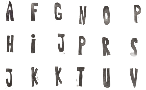

Each sheet when finished was scanned to my computer at 600 DPI though lower resolutions should be fine as well.
Specifically, I would stamp a page, scan it in and then work on the remaining image editing pieces. This allowed me to work in batches and not feel entirely overwhelmed.

To set up the editing workflow, I imported the Calligrapher template PDF into GIMP and set up each page as its own layer.
The edit workflow is a few minutes per character. Again, there may be more efficient ways of approaching this but I would edit these characters when I had downtime at my computer. The small moments where my toddler was occupied or the windows between daycare drop-off and work.
My first process video is below!
Take scanned sheet and crop a single character with wide margin around it. I used the standard Windows picture editing tool.
Use a strong background remover tool to remove the white background. The standard Windows one was not great, in my opinion. I love Delphi Tools for this.
Adjust the brightness down to zero, contrast up to 100 and shadows down to 0 to get a crisp black letter. Crop to the character and remove the whitespace. I also used the standard Windows picture editing tool for this.
Load the character into GIMP or another robust image editing tool and scale the layer to the box height from Calligrapher. For me, this was 500px for each character. Move it into its box on the template.
When all characters are finished, each set of characters gets flattened to each page so that there is once again one page per layer. Then, the project gets exported as a PDF with the option checked for each layer as its own page. This will give you the PDF that is ready to upload to Calligrapher.

The Windows background remover brush tool is pretty easy to use to clean up stray marks.
When a Calligrapher template page is finished in GIMP, flattening the visible layers helps keep the layer mess to a minimum.
A project in GIMP can be saved! I would save regularly and if I needed to close GIMP, I could open the project and be right where I left off.
You do need to size the punctuation relative to the letters for Calligrapher.

Calligrapher is straight forward to use. It requires an account to sign up but is otherwise free and not annoying. There are a few steps from uploading the template to adjusting minor settings within the app but really once the PDF is filled out, the process is basically complete.
From Calligrapher, the font can be downloaded as an .otf or .ttf, which are two standard font formats that can be easily installed to your computer through the Fonts module or into web apps.
Overall, this was much easier than expected and a 10/10 creative payoff. A few folks mentioned on my Note that they were planning to try this! I’d love to see more of these block letter fonts out in the wild.
This is great! And thanks for recommending Calligrapher--I'm in the early stages of making a font, and that was the step that I was most uncertain about (creating the .otf)
Thank you!!!! Also working on making my own font and figured out the first few steps for digitizing but was stuck from there. Thank you for the clear explanations and sharing your process. I am foraging for wild fonts and "street stamping" with clay instead of carving them but both techniques create a stamped image. I'm so excited to try out your digital advice.